Changing the Face of Arabic

Sandy Saghbini and Raisa Zaidi explain the complex, controversial, and creative impact of technology on Arabic typeface development

Arabic Around the World

Over the past two decades, the influence of Arabic language and culture has swiftly spread across the world. Indeed, Arabic is one of the most widely spoken languages on the planet — it is spoken in 23 countries and is the native language of roughly 300 million people. Designer David Learman claims that the Arabic language has not only influenced countries around the world, but has also spread “rapidly across most developed societies.” He goes on to assert that “no matter where you are located — London, Paris, Berlin, or indeed on the other side of the world in the U.S. or Australia — awareness of Islam and Arab cultures is becoming increasingly important from a design and communications perspective.” As design practitioner Halim Choueiry points out, many experts consider globalization’s greatest impact to have been on the Middle East. At the heart of such change is the Arabic language itself.

With the development of communications technology, Arabic designers have worked hard to ensure that their language is included. However, this is only a recent development. For years, Middle Eastern designers and typographers struggled to keep up in a global market largely dominated by Latin-based alphabets. These struggles have plagued the development of Arabic typography throughout history. Indeed, Arabic calligraphers were not initially part of Gutenberg’s movable type innovation of the late 1440s, mainly due to the language’s cursive, non-Latin structure. Renowned typographer Mourad Boutros offers insight to Arabic’s traditional structure and its conflict with the function of the metal press (movable type). To put it simply, the “methods of creating typefaces for printing from metal type were developed specifically for the Latin alphabet,” meaning that languages with other alphabets, such as Arabic, had to conform and make sacrifices in order to use the same process and keep up with the world’s technology.

Difficulties with Movable Type

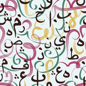
Such sacrifices often meant total reconstruction of Arabic letterforms. Metal type consisted of blocks of metals that were divided into units,” with the “deciding and dictating factor” for Latin typefaces dealing with the construction of the letterforms to their collective height. In other words, it was ultimately the height of the metal type’s body that determined linear type for Latin alphabets. As Boutros further explains, the majority of Latin fonts are designed “so that each letter is set and spaced apart from its fellows.” Latin fonts can also “be described as being of a vertical construction,” with much emphasis placed on the ascenders and descenders of its letters. Arabic, however, appears to be the complete opposite in its construction, with much emphasis placed on letterforms that are physically linked by a horizontal line within a word. It is precisely Arabic’s more fluid and horizontal form that puts it in such contrast with the more “controlled and inflexible Latin letterforms.” And, to make things even more complicated, the Arabic alphabet’s 28 basic letters each have different forms depending on their position within the word: whether the letter is at the beginning, middle, or end of a word changes its appearance.

In the article “Advances in Arabic Printing,” Walter Tracey, who in 1947 became the manager of typeface development for Linotype, explains that Arabic’s cursive characteristic and the variations in letterforms “made the manual and mechanical typesetting of Arabic a more laborious task than the typesetting of European languages.” In turn, this made it difficult for Arabic-speaking countries to keep up with the technology of movable type and printing. The metal press had initially been created for a vertical, spaced, and less fluid alphabet than Arabic.

The Merging of Western and Arab Worlds

Arabic has managed to become one of the most influential languages in today’s global communications market thanks to the collaborations between Western and Middle Eastern businesses. Halim Choueiry explains that, for the last century, the Middle East has been “importing to the Arab world what has been produced by the West,” which has “resulted in many people growing accustomed to speaking two languages.” The Middle Eastern country of Lebanon is often used as a prime example of this, since most of the population speaks Arabic, English, and French to such an extent that it is normal for them to switch between and integrate Latin words into their everyday conversations. Lebanon is also known as one of the most Westernized countries in the Middle East, where many multinational companies kept their offices during the 1960s. Most creative work in advertising, design, or branding took place in Lebanon’s capital, Beirut, before the onset of war in 1975. With the oil boom of the Middle East, both multinational and local companies wanted to create brand identities that would appeal to Arabic speakers while keeping their Western identity. This resulted in a movement in which Latin letterforms and Arabic letterforms appeared together in logo designs, ultimately bridging the typographies of Western and Arab worlds.

Simplifying the Arabic Alphabet

This collaborative design method proved quite successful in establishing trendy and memorable brand logos for both local and multinational businesses, prompting designers to think of more creative ways for Arabic and Latin alphabets to interact while keeping the original logos’ feel. But such wasn’t new: about 20 years earlier, a Lebanese architect and typographer, Nasri Khattar, created “Unified Arabic,” a simplified printed form of the Arabic alphabet that consisted of 28 detached characters. Unified Arabic “was meant to ease the learning and writing of the script by reducing the number of shapes letters could assume.” Indeed, Khattar’s approach toward simplifying the Arabic alphabet ignited a movement that is still influencing many typographers and designers today.

A key figure in this movement is Boutros, who is best known for the development of “Simplified Arabic Type” in 1993, which revolutionized Arabic’s availability on computers. With his wife, Arlette Boutros, they created truetype fonts that were compatible with Microsoft’s Arabic Windows as well as the Mac OS Arabic Language Kit. The Boutros couple has also designed more than 50 Arabic typefaces, with some available on IBM printers as core fonts. But aside from these accomplishments, Mourad Boutros had followed Nasri Khattar’s lead by designing a detached, non-cursive Arabic font known as “Basic Arabic.” By creating a detached alphabet, Arabic became more compatible and simpler to work with when dealing with Latin-based computer systems, and also became more appealing to non-Arabic speakers and the global-market.

However, merging the Arabic alphabet with Latin alphabets is a complex undertaking. According to Boutros, “Conveying a theme from one language to another is not a simple task, and we should not treat this lightly, given all the cultural connotations that it entitles… Latin and Arabic typographies should interact as if putting two cultures together. Once each shows its own identity then, in the design of the artwork, the typographies will work concurrently.”

Keeping Up with Modern Technology

But why is it so important for the Arabic alphabet to be simplified and merged with Latin alphabets? Boutros explains that the movement to simplify the Arabic alphabet will help solve problems that have made technological advances with typography difficult in the Middle East. For example, the first mobile phones in Arab-speaking countries did not have an Arabic typeface, so mobile phone users would use the Latin alphabet to express Arabic words. However, not all Arabic letters could be matched by a Latin letter, so Latin numerals were used in between the Latin letters in order to properly express the Arabic word. According to Boutros, this created “a hybrid language based on technological limitations that became habit.” Even with today’s availability of the Arabic Mobile Interface, this type of language is still used when texting, emailing, and chatting. Boutros told Language Magazine that his books were meant to address these types of problems.

The dearth of Arabic fonts installed on computers is a result of the fact that only Latin based languages were taken into account at first. Only two Arabic fonts are currently installed in the majority of users’ computers around the world, which means websites created in Arabic stay limited to these fonts so they are readable to most visitors. Therefore, most Arabic websites come across as bland and messy.

One of the most important developments for the improvement of Arabic typeface design came about in the late 20th century, with Letraset’s invention of the dry transfer process. Boutros explains that this process allowed typographers to use “Instant Lettering” sheets to form words and texts by “releasing a letter from a retaining sheet.” Letraset’s development ultimately led to the production of the typeface Tanseek, which took a new approach in developing Arabic for print. Unlike prior Arabic typefaces developed for movable type, Tanseek was developed with Latin being used as a supplementary font. Instead of having the Arabic alphabet depend primarily on supplementing the Latin alphabet, the Latin alphabet was now being used to supplement the Arabic alphabet. Tanseek proved to be highly successful in its bilingual approach, resulting in a harmonious relationship between Latin and Arabic alphabets.

Detached Arabic Alphabet: An Educational Tool

Keeping up with and solving problems concerning technology are not the only good reasons for simplifying the Arabic alphabet. One of the most important reasons revolves around making the language easier to learn for non-Arabic audiences. “Unified Arabic” and “Basic Arabic” are described as typefaces that serve “as educational tools to simplify and accelerate the process of learning to read and write Arabic.” Making Arabic less difficult to learn is the subject of Cultural Connectives, which focuses on Mirsaal, an Arabic font that Abou Rjeily created from scratch to lend a more detailed understanding of harmonizing Arabic and Latin alphabets. The presentation of Mirsaal is creative, visually appealing, and easily understood. Yet, creating a detached Arabic alphabet poses problems as well. Many Arabic speakers have voiced their concerns about a detached alphabet, several believing it to be inappropriately “Westernizing” the language and stripping it of its cultural tradition.

But Abou Rjeily believes otherwise, “Calligraphy and typography have very different purposes and, in my opinion, separating Arabic type from calligraphy is not disrespectful — on the contrary, it assists in the development of the language and leaves room for experimentation.” She also tells Language Magazine that Mirsaal was not created nor meant to be seen as a substitute for the Arabic alphabet. “Mirsaal is a message, a medium that helps simplify a very complicated script. It is not a substitute.”

To get this message across, Abou Rjeily juxtaposes the traditional Arabic alphabet with the Latin alphabet in a way that makes it easy for readers to compare the two, “Instead of totally substituting Arabic with Latin, or using calligraphic Arabic, which has a very complicated shape, I use a detached font to introduce Arabic to non-Arabic speakers.” Mirsaal “maintains the integrity of the Arabic script and letters by only simplifying their representation. Each letter has one shape wherever it stands in a word instead of three or four shapes. This way it’s less difficult to recognize the letters and memorize them.”

Cultural awareness is of great importance when merging of Arabic and Latin alphabets. Large corporations have made huge mistakes when advertising their products in Arabic, sometimes coming off as culturally inappropriate.

Still a Long Journey Ahead

Whether in design, technology, or business, the Arabic language has experienced immense growth in a short period of time. Yet, there are still many obstacles that continue to afflict its growth. If Western developers don’t open up more toward Eastern languages, these problems will continue to persist. In order to gain more support, it is up to Arabic-speaking typographers and developers, like Mourad and Arlette Boutros, Choueiry, Kandalaft, Abou Rjeily and others, to bring forth creative and innovative designs that will revolutionize Arabic’s participation in technology, as well as preserve its cultural tradition and creativity.

References

Abou Rjeily, R., Cultural Connectives Mark Batty Publisher, New York (2011)
Boutros, M., Khouri, A., Learman, D., Choueiry, H., Kandalaft , G., Abi Aad, A., Talking About Arabic; Mark Batty Publisher, New York (2009)
Boutros, M., Arabic for Designers; Mark Batty Publisher (2006)
Krek, M., “The Enigma of the First Arabic Book Printed from Movable Type”
Tracey, W., “Advances in Arabic Printing” British Journal for Middle
Eastern Studies
Vol. 2, No. 2 (1975)
Lunde, P., “Arabic and the Art of Printing” Muslimheritage.com
http://muslimheritage.com/topics/default.cfm?articleid=988#ftnref2
Malkawi, L., “Alternative Layouts for the Arabic Keyboard: Optimizing
Usability, Speed, Comfort, Accuracy, and Learning Curve” (2002)
IBM Office Products Division, “Typewriter: An Informal History” (1977)
http://www-03.ibm.com/ibm/history/exhibits/modelb/modelb_informal.html

Sandy Saghbini is currently a student at the University of California, Irvine pursuing a BA in English with minors in psychology and educational studies in preparation for graduate schooling in school psychology.

Raisa Zaidi holds a BA from UCLA in political science, minoring in public affairs and Middle East North Africa studies. She has written for the Daily Star Lebanon, and attends Columbia University Graduate School of Journalism.

August 2011

Joining the Digital Dots

August 2011 Cover

Traditionally every August, we publish our annual focus on technology, hoping that many readers will have a little extra time over the summer to assess the latest developments and work out where they can find the means to finance them. However, technology has now become so much a part of not only the language education process but communication in general that we would find it difficult to publish any issue without covering technical innovations.

Because of this plethora of products and current budgetary woes, it is more important than ever to take the time to assess the value of new programs and devices before jumping on the speeding technology bus, so our August issue will continue to focus on technology with the emphasis on the practical — making technology work instead of getting carried away by the latest gadget. In this edition, there’s a feature on classroom tasks suited to interactive whiteboards, a round-up of the latest internet-based language programs, and an in-depth look at how Arabic designers have tackled the challenge of adapting their language to the Latin script bias of the digital age. More

IN THIS ISSUE:

Reach Out and Read (Aloud)
Stephen Krashen with an inexpensive, simple approach to closing the equity gap in literacy

Separado o Together?
Else Hamayan reflects on the separation of languages of instruction

Enlivening the Board
Sarah Withee offers advice on using interactive whiteboards for communicative language teaching

Web of World Languages
Language Magazine’s selection of the latest in online world language learning

Changing the Face of Arabic
Sandy Saghbini and Raisa Zaidi explain the complex, controversial, and creative impact of technology on Arabic typeface development

Staying True to Type
Sandy Saghbini asks Rana Abou Rjeily, creator of Mirsaal typeface, how type designers adapt to changing demands

Renaissance? What Renaissance?
Mourad Boutros shares his passion for creativity with Arabic design

Spanish from Cartagena to Patagonia
Language Magazine looks at study abroad options in Colombia and Argentina

Last Writes
Richard Lederer with Good Book words

Chinese in Taiwan or China?

Blue departures board for major cities.

While the obivous place to go to learn Chinese is, well, China, it’s sometimes easy to forget that for quite a while after the communist takeover on the mainland, Taiwan (officially the Republic of China) was the only “China” recognized by the Western world. Global politics aside, Chairman Mao’s victory has resulted in some lingering after-effects for Mandarin Chinese learners as well.

First of all, the flight of China’s imperial government to Taiwan in 1949 introduced Mandarin as the principal means of communication across the island. The ensuing complete political separation between Taiwan and mainland China meant that Taiwan’s writing system never underwent the same simplification the communists enacted to increase literacy on the mainland. Now, only Taiwan and Hong Kong continue to use traditional Chinese characters, while China itself has fully switched to simplified characters.

Due to the United States’ history of good relations with Taiwan, coupled with the mutually held suspicion of China during the Cold War, Chinese language instruction in American schools and colleges continues to emphasize learning traditional over simplified characters. American students learning Chinese might therefore find studying in Taiwan meshes more easily with their program of study. Even for those contemplating studying abroad without prior language experience, Taiwan is an excellent option to consider. It is much easier to learn simplified characters after having studied traditional, but more difficult to reverse the order.

Taiwan has more attractions than simply its writing system to offer the curious student. Its capital of Taipei is a bustling, cosmopolitan city with pan-Asian cultural influences. Past colonization and rule by China, the Netherlands and Japan coupled largely autonomous rule after Word War II have resulted in a rich and unique culture and a certain local pride separate from mainland China. Taiwan also was not subject to the cultural devastation wrecked by Chairman Mao in the early decades of Chinese Communist Party rule, so many historical artifacts and some practices like traditional puppet theatre were preserved in Taiwan. Taiwan’s government has instituted democratic and liberalizing reforms over the past few decades, so the difficulties of internet censorship, restrictions on free speech, and political sensitivity on the mainland do not apply to Taiwan.

The two major cities in Taiwan are Taipei and Tainan, although several good language institutes are located in Taichung as well, and the countryside of Taiwan is notoriously beautiful.

Volunteer and Study in Japan

With the increasing consumption of Japanese cultural products in the United States, and especially with the proliferation of manga and anime, Japanese has become a popular alternative to the traditional canon of commonly taught foreign languages. Most colleges and universities and even some high schools now host study abroad or exchange programs with sister schools in Japan.

The most common places to study Japanese language in Japan are centered around Tokyo and Kyoto, although other options are available. Three of the most well-known and reputable study abroad options for prospective students are the International Christian University (ICU) in Tokyo, which has been hosting international study abroad students for decades, and offers excellent intensive Japanese instruction, the Associated Kyoto Program (AKP) in Kyoto which also accepts American study abroad students for a year-long program at its Kyoto campus, and the two IES programs in Nagoya and Tokyo.

The two principle dialects of Japanese are centered around Tokyo and Kyoto/Osaka, although further to the north and south of Honshu, the main island, and especially on the smaller islands, spoken Japanese may differ widely. Standardized education, greater national integration, and the adoption of a single dialect for television, radio and government use have, however led to the prevalence of Standard Japanese (the Tokyo dialect) nationwide.

2011 Tohoku Earthquake and Tsunami

In March of 2011, a combination earthquake, tsunami, and nuclear emergency hit Japan, with the greatest damage concentrated around the northern Tohoku region. Immediately following the disaster, Japan received a wave of international condolances and aid, including widespread donations to the Red Cross and envoys of aid workers. Now, however, world attention has moved on but Japan still faces a daunting task of reconstruction. Volunteers, especially those with some knowledge of the Japanese language, may be even more welcome now than immediately after the quake. Volunteering, moreover, is always an excellent means of connecting with people and exploring a culture on a deeper level than would be possible by merely acting the tourist.

The current US Travel Warning (expires August 15, 2011) advises citizens to stay outside a 50 mile radius of the Fukushima Daiichi Nuclear Plant, but has confirmed the safety of Japan’s food and water.

English in America: Niagra Falls

Niagara Falls

After stealthily blending in with the masses of Manhattan Island for five weeks, my inner-backpacker told me it was time for an out-of-city adventure. I contemplated Montauk and Green Mountain, pondering over maps and lack-luster tourist guide books, until I finally decided on what was both an obvious and predictable location; Niagara Falls. My reasoning was, despite the ten-hour train journey (a distance most Brits would treat like a round-the-world trip, packing enough food and water for a month) I was near enough to say I was in the “same part of the world” and therefore I should make the visit.

Staying in a hostel on the New York side of the border (just to enhance my hopes of becoming an explorer for the week), I quickly became acquainted with the town — its weathered exterior and seemingly restless inhabitants almost as intriguing as the falls themselves. In just under a mile, the bustling tourist destination dubbed the ‘Honeymoon Capital’ of the 1950s; hastily transforms from a deluge of 100 ft. cascading waterfalls, cliffside restaurants and bouncing tourists into a sea of derelict shopfronts and shy residents peering from the windows of tired houses, seeking out any sign of disturbance. Niagara’s 1950s population of roughly 100,000 has since halved, with whole families moving on to different towns and states due to the worsening employment conditions.

Consequently, the few locals that I did meet were working around Niagara Falls Gorge, entertaining tourists with boat tours and guided walks, and serving up a coolly polite “Enjoy your visit” to every photo-snapping swarm. Noticeably, also, was that although sharing one of the world’s biggest natural landmarks with an entirely different nation, both towns of Niagara Falls, Ontario and New York are more than willing to mock each other, culturally and linguistically.

Despite separation by a mere short stretch of water, accents, etiquette and official languages of the two cities are poles apart; I realized this on passing a souvenir shop five minutes within the Canadian border, with a t-shirt reading “I speak two languages, not just one. I live in a house, not an igloo. I eat meals not just maple syrup. I am Canadian.” proudly hanging by the door.

Right from the borderline there was an overwhelming sense of a cultural divide, experiencing both sides of gorge flippantly throwing about the casual “us” and “them” when referring to the other. Neatly displaying every road sign, tourist information board, and site map in both English and French, Niagara Falls, Ontario made for the more linguistically stimulating experience, — particularly for me — an outsider.

Bilingualism aside, eating breakfast in the U.S. and dinner in Canada couldn’t have been more different. A hand-on-hip “More coffee honey?” became a sprightly “Will that be all, Miss?” teamed with a side of sharp eye contact and a sprinkling of urgency. In essence, this reflected two things: the reserved, business-oriented atmosphere and the reminder that visitors are what keeps this town ticking. The falls themselves are also treated with similar possessive pronouns; “ours” and “theirs” to refer to the American and Horseshoe falls on each appropriate side, attaching verbal ownership to the already existing geographical.

Just like other natural phenomena in the world, Niagara Falls has shaped the towns around it, not just physically, but in giving its inhabitants a sense of pride. In this instance, a unique piece of geography becomes two, each receiving a different cultural family and therefore a different cultural history – and having roots in neither made my visit an ever more thrilling experience.

Athina Kontos is writer/photographer from the UK spending the summer in New York

First National Spanish Bee Crowned

Victorious Juarez

Victorious

Evelyn Juárez, a seventh-grader from host-state New Mexico, made history by winning America’s first National Spanish Spelling Bee this weekend. She won by correctly spelling the word bizantinismo, which means excess luxury.

Juárez was locked in a mesmerizing, hour-long duel with runner-up, Germán Rojero, at the final stage of the competition before taking the title, when Rojero misspelled kanindeyuense, which refers to someone from the Canindeyú territory of Paraguay.

Thousands of kids across the nation have spent months burning the midnight oil, learning complex words in the hope of being crowned the 2011 Spelling Bee champion. But, for the first time ever, America’s most-beloved competition was in Spanish as well as English.

Despite many misconceptions, all of the eleven finalists were fluent in English as well as Spanish. The National Hispanic Cultural Center (NHCC) in Albuquerque, New Mexico, hosted the inaugural National Spanish Spelling Bee on July 9th 2011.

Cash For Good Italian Grades

Italian Language Foundation Announces Dante Award for Excellence in AP Italian Language Studies
Incentive for AP Italian Students

Initiative Follows ILF Funding of Workshops to Increase Ranks of Teachers of Italian

The Italian Language Foundation has announced a financial award for students who score well on The College Board’s Advanced Placement Test in Italian Language and Culture, or AP Italian.

The Dante Awards for Excellence are unrestricted and will be given to students who score a four or a five in the AP Italian exam, which will be given in May 2012. The amounts of the award are $200.00 for students who score a five and $100.00 for those who score a four.

“The Foundation’s Dante Award for Excellence will recognize significant achievement by students of Italian Language and Culture,” said Margaret I. Cuomo, M.D., president of the ILF. “It is an incentive for students to apply themselves to the study of a great language and culture at a time of globalization and increased cultural and commercial exchange between two great countries and during a period when governmental support of world language studies is under attack.”

The Dante Award for Excellence is part of the ILF’s programming to build participation in the U.S. and abroad in AP Italian, which is being reinstated beginning in the fall of 2011.

The Foundation is also currently underwriting the cost of workshops for teachers of high school Italian who will ultimately be certified to train other teachers in Italian language and studies. The workshops are administered by the American Council on the Teaching of Foreign Languages (ACTFL). The first two days of the intensive workshops were held at the Columbus Citizens Foundation in New York City, on May 14 and 15, and the final two days will be held at the Generoso Pope Foundation, in Tuckahoe, New York, on August 27 and 28.

“The Italian Language Foundation’s goals include increasing teacher and student participation in AP Italian,” Dr. Cuomo said. “Teacher response to the inaugural rounds of workshops has been very encouraging, and we look forward to sponsoring additional workshops to increase the number of highly qualified teachers of Italian language and culture.”

Both the Dante Award for Excellence and the ACTFL workshops are open only to students and teachers who are members of the Italian Language Foundation. Students may become members for free, and teachers may join at a cost of $25.00. More information is available at www.ItalianLanguageFoundation.org.

The Italian Language Foundation is dedicated to promoting and sustaining Italian language education in the United States and supporting the College Board’s Advanced Placement (AP) program in Italian Language and Culture. The Foundation is a not-for-profit 501 (c) (3) corporation qualified by the Internal Revenue Service to receive tax deductible contributions.

Spanish con Leche – Livemocha ACTIVE SPANISH

Spanish con Leche
Livemocha ACTIVE SPANISH
Online Subscription (plus 4 handy books)
Merriam Webster, HarperCollins, 2011

Merriam-Webster, America’s leading dictionary publisher,
has teamed up with Livemocha — the world’s largest online language
penpal community — and HarperCollins, the UK-based dictionary
and language learning publisher, to launch a new type of language
learning program.
Livemocha Active Courses incorporate a social dimension to the
language learning process with a six-month membership to a
Livemocha course online, connecting the user with a network of over
nine million native speakers and instructors. The online element provides
a fun, interactive environment for users to practice their new
language and share cultural tips with language partners worldwide-24
hours a day. Each course, available in Spanish, French, German, and
Italian, includes four full-color companion books -beginner to intermediate
– for those times when you can’t get to a computer.
Livemocha ActiveSpanish must be one of the most user-friendly
language learning programs around — within 10 minutes of opening
the box, I was already receiving feedback from native Spanish speakers
all around the world on my first completed unit. Their response
was pretty complimentary so I decided to up my level, expecting that
it might be easier said than done. I was wrong — it was as easy as
clicking on a tab or two and I was off again. Learning in a vacuum
has never been my forte even though I love to read and write.
LiveMocha quickly gives you the opportunity to have your recorded
roleplays reviewed by an “expert” for the cost of a few “tokens”
(about a dollar or you can earn tokens by helping out learners of your
mother tongue) or you can opt for review by native speakers (eager
to earn tokens). The system works surprisingly well and feedback is
almost instantaneous.
In each unit, you receive multiple exposures to target vocabulary
and grammatical structures, which some learners may find a bit
repetitive but you can move on to the next example with just one
click if you’re that way inclined. The video quality is professional with
attractive and personable actors that wouldn’t look out of place in a
telenovela. There’s a good mix of listening and reading comprehension
with simple “drag & drop” answering which relieves the drag of
typing. Actually, the program requires remarkable little typing which is
a big bonus.
At the end of each unit, you are asked to roleplay in creating a
conversation after a short example which may seem daunting for
some learners but you can have as many tries as you like, and all
practice helps.
The Spanish program reviewed was Latin American Spanish but
no mention was made of this on any of the materials (even though it
was obvious by the subject matter of the units) so check to make
sure that you are choosing the right program for your circumstances.
Livemocha Active Spanish offers a simple, effective means of
improving grammar, vocabulary and fluency with the killer dimension
of interactivity with native speakers that adds the spark of motivation
so often missing in self-study programs. It is highly recommended as
a supplemental learning program. — Daniel Ward

English in America

Etiquette

It has been said that the best way to see a city is by wandering around, equipped with just enough of a plan to know where you need to be, but allowing room for improvisation along the way. It is with this mentality that I have managed to work my way around the momentous grid that is New York City, finding myself in wonder-induced reveries, overwhelmed with taxi rides at race track speeds, aromatic worldly cuisines (at any time desired) and enough vintage Hendrix records, theatrical Broadway excitement and ancient treasures on the museum mile to keep any culture buff occupied for a lifetime. Whilst absorbing the atmosphere to the best of my British trained abilities, I seem to have zoned in and out of different happenings, overhearing sound bites and snippets of conversations such as “…because this is New York” and “…yeah, but you know New York…” along the way.

After hearing this for the first time on a packed Subway train – all of the surrounding elements (a sea of commuters, failing air conditioning and a man slumped in a corner with a cage of newborn puppies) taken into account , it made complete sense. Although when I heard it again in a luscious green patch in Central Park and then something similar outside a painfully trendy espresso bar in the West Village, it sparked a sense of overwhelming togetherness that the city has; not only in its cosy architecture but in the relationships of its inhabitants. I realized that people here are proud of what they do and where they come from, having created their own rules and terms of conduct along the way and consequently maintaining a healthy city environment by talking about it.

Whether it’s the lady named Bonita serving me my morning latte and telling me to “Have a great day” or the homeless man in 86th Street Subway station pleading with commuters for any spare change with a remarkable politeness for such desperation, people here are courteous and genuinely believe in the power of language. For me, coming from a city where people avert eye contact if they see someone they know walking towards them down the street, this is a new and inspiring experience. In comparison to the UK, it seems like language manners have been taken to a new level of brilliance, even if “Have a nice day” comes as part of a job description.

Londoners are constantly reminded to be politically correct, taking care not to offend anyone in any way that could be held against us by law and ensuring that any text message or email we write doesn’t give the recipient the “wrong impression.” With so many rules and language concerns, one would think that customer service and even simple politeness should be first and foremost, but even during my last moments in the country, a trip to the airport magazine stand left me feeling disheartened and like I was more than lucky to have a crumpled piece of paper reading “London LHR to New York JFK” in my hand.

So far New York has proved itself to be firm but fair, if you treat people with respect then you will certainly get it back and it seems like the way to start is to show concern for the wellbeing of others through language. Before I came here I would never have dared speak to a stranger in an elevator or discussed football scores with a taxi driver, and the idea of saying hello to an innocent dog walker on the street just because your paths have crossed would probably seem entirely unnecessary to most Londoners. But in actively doing all of these things, I have managed to find a sense of belonging, even if it is approximately 3458 miles from home.

Athina Kontos is writer/photographer from the UK spending the summer in New York

July 2011

Blurring Subject Borders

July 2011 Cover

Most of us have a tendency to compartmentalize whatever we can — slotting information, knowledge, experiences into a defined category makes it easier for us to cope with new information. However, we learn that if we over-simplify we will eventually need to reassess our classifications.

In this issue, James J. Lyons argues that multilingualism should be at the core of federal education policy as domestic demographics and international realities make a coherent and thoughtful national policy on second language learners and multilingualism more important than ever before. More

IN THIS ISSUE:

Reaching for the Skype
Caroline Martin sees how internet-based communications are revolutionizing the language classroom

The Elephant in the Education Policy Boardroom
James J. Lyons argues that multilingualism should be the centerpiece of federal education policy

Thousands of Words
Kate Sommers-Dawes tells the truth about Mexico’s warm welcome in pictures

Spanish Immersion Ideas in Mexico

From Paris to Dakar
How will the Arab Spring and Africa’s development affect French’s position in the world?

French Immersion Options in France

French Schools in Québec

Beat the Recession: Teach Abroad
Nicholas Ferdinandt suggests English teachers look abroad for short-term teaching employment that will not only be the experience of a lifetime but could also be just what your resume needs

Last Writes
Richard Lederer with a hidden Shakespeare

Language Magazine