Raisa Zaidi talks type with font designer Mourad Boutros
Mourad Boutros is a man of many Arabic letters. A renowned Lebanese typographer, Boutros understands the importance of meshing the traditional with the contemporary — and he shares this knowledge with the world through his work in the international community and with the multiple books he has written on Arabic typography.
The last time we spoke to Boutros, in our August 2011 edition, he was working on the updates for the second edition of his Arabic for Designers, by Mark Batty, to be on the market by the beginning of next year.
LM: Tell me about your second edition. Are there are any changes since you published your last book when it comes to Arabic typography?
MB: Of course, a lot of changes are happening all the time. New typefaces have been introduced, corporations have been emerging or newly bought by other corporations, technologies are emerging on a regular basis. I am always having to deal with changes. We introduce new typefaces all the time based on research. The latest is Boutros Minaret, based on the latest in the Arab world, USA, and Europe.
Any modern typeface has to be quickly and easily read by all age groups and this is not always the case. Modern typefaces are suitable for headlines and subheadings. I would not use modern typefaces as body text. We are delivering a message to the consumer based on specific objectives and that is why a traditional typeface is more appropriate for body text because it is legible by all age groups.
Al Arabiya and the BBC Arabic are very good examples of the difference between modern and traditional.
LM: What is something you feel we should all understand about Arabic typography choices?
MB: Many cursive and non-cursive scripts have come to light since the days of lead type, and designers are adapting at all times to catch up to the speed of technology. These developments started with the introduction of hot metal type, then photocomposition by Linotype in the early 70s where the typeface Yakout, among other typefaces was introduced. It still is the best typeface used today in the desktop publishing world due to its design characteristics, that were well studied by the designer Walter Tracey and his team of experts.
Letraset in 1976 started work on a wide range of Arabic typefaces, expanding to about 50, using the Ulano cutting process for their lettering, employing negative film printing on dry transfer sheets that were then used by the designers to be rubbed down onto paper one character at the time. Since then, we’ve gone to digital type and Letraset, and many other software companies have entered the market supplying digital typeface design through applications such as Fontstudio, Fontographer, IKARUS and Fontlab.
I’d like to maintain that Tanseek (designed by two professional groups consisting of Dave Farey, Arlette Boutros, Richard Dawson and myself) remains the first and only harmonious range of Arabic-Latin serif and sans-serif typefaces to serve the needs of today’s creative industry. Users of Tanseek include the MBC Group, Arab Cup 2012, Durrat Al Bahrain, Saudi TV, Doha TV, Oman Botanic Gardens and many other market sectors.
Not everything called modern or contemporary is better than the traditional. Why do we need to match the Latin [alphabet] always? Why not the other way around?
To me, Tanseek matches naturally with the most well-known Latin fonts, such as Futura, Frutiger, Helvetica, Gill Sans, Univers, Garamond, Times, Palatino and Franklin Gothic.
LM: Let’s talk about the typeface Boutros Advertisers Naskh. You claim it is the most used — and pirated — typeface for bilingual signage (Arabic and Latin) around the world since 1977 for indoor and outdoor signs, airports, hospitals and offices. Users include Dubai International Airport, Riyadh International Airport, 3M and The Bechtel Corporation.
MB: I do not claim. It is a fact… Due to the piracy we learned that we had to deal with a cultural issue [regarding font design]. You cannot force people to stop stealing. Simply, they have to learn that it is not right. Thankfully, there are a lot of individuals and some corporations who respect intellectual properties and we do enjoy very much working with them.
As for the type style, the addition of linked straight lines to match the Latin baseline level was designed by Arlette Boutros and me, in collaboration with Letraset, to work in harmony with fonts like Garamond, Palatino and Times Roman as well as Helvetica, Futura and Frutiger. The design is based on the classical Naskhi style respecting Arabic calligraphy and cultural rules.
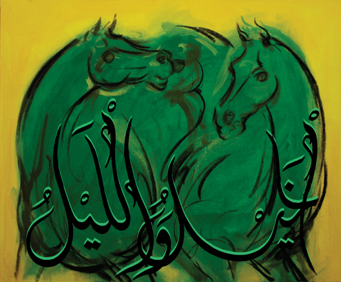
LM: Tell us about your recent show in Berlin with artist Emmanuel Guiragossian.
MB: Our paintings were displayed at the World Arabian Horse Racing Conference Award Gala Dinner at the German Historical Museum, Berlin on June 9, 2012. Prior to that, in November 2011, they were on display at an event in London’s Banqueting House, attended by HRH The Prince of Wales. The collaboration was a very interesting project and a challenging experience. It proved to me that the idea of mixing Arabic calligraphy with art in a concept that is giving a specific message will work. I think we succeeded. It is not easy at all putting two minds together to come up with one piece of art. It was a lot of work, discussions, changes, changes and changes until both were satisfied. Because of the results, I look forward to other projects with Emmanuel and other artists.
Raisa Zaidi, who recently finished the Colombia University graduate program in journalism, is a regular contributor to Language Magazine.
Painting shown above by Emmanuel Guiragossian and Mourad Boutros. The Arabic calligraphy on the painting reads: The horse, the night and the desert knows me and the sword, the spear, the Paper and the pen. — Abou-Tayyib Al Mutanabbi. Oil on canvas.100 cm height x 180 cm width. 2010.


